Site Plan
Site Name and Purpose
My site's name is called Kevin Dench Design. The purpose of my site is to provide an interactive resumé for potential employers. I would rather "show them" rather than "tell them" that I would be worth hiring.
Target Audience
My target audience will be traffic directed to my site from my behance.net and linkedin.com accounts. I also would like to consider people that would want to hire me to do freelance projects. Most of all my target audience will be directed towards potential employers. Once I am gainfully employed after school, then my audience will change to people who will want me to do freelance projects for them.
Personas
Personas are developed to determine our audience. In industry companies put months into developing personas. First they will organize a focus group, and ask a series of carefully phrased questions. These focus groups require a moderator, a very skilled moderator will be able to ask questions that are not leading. This will produce the best possible results for the company. This information is then taken and personas are developed. It is typical to take all the answers from people of similar genders and backgrounds and generalize them in order to create a persona for that category. They will do this until all the information has been covered. These results are invaluable to the company. Personas will be used for market research, logo redesign, product design, web design and a variety of other projects that require audience input.
Male Personas

Name: Robert Seckerman
Age: 26
Occupation: Creative Director
Wants and Needs: Robert likes to find what he is looking for fast. He doesn’t have a lot of time. He has become a master of efficiency and it doesn’t take long for him to figure out if something is a waste of his time. He needs to be able to navigate a web site very easily, and if he is investigating a potential hire their work needs to be easy to access.

Name: Ken Wyatt
Age: 38
Occupation: Business Owner
Wants and Needs: Wants and Needs: Ken wants to get his name out there, but Graphic Designers can be expensive and they don’t always work with him the way he would like, so he’s turned to looking on the web. He needs to be able to find the Designer’s work and information easily otherwise he gets a little skiddish.

Name: Rich Gunderson
Age: 45
Occupation: Entrepreneur
Wants and Needs: Rich is an ambitious man. Whatever he wants he just takes. He has always been that way. Recently he has decided he wants to branch out, but he needs a designer to do it. He has a clear vision of what he wants, but he has never been good with computers. He’s more comfortable talking to a real person so he can read them. He needs a website where he can find examples of work and contact information very easily, or he is going to lose interest and move on to another site.
Female Personas

Name: Bridgette Fillerson
Age: 24
Occupation: Blogger
Wants and Needs: Bridgette is interested in what is trending right now, and is always looking for the next interesting story. Recently her blog has been taking off and she is looking for a way to expand her web presence. She has a great eye for design; she just doesn’t have the time to do what she wants. She needs a website that won’t waste her time with a lot of subfolders and clicks or she’ll get lost and leave.

Name: Karen Deckmore
Age: 32
Occupation: Business Owner
Wants and Needs: Karen is opening a business and needs to find a designer to give her business its face. She has a specific vision in mind but doesn’t know how to execute it. She doesn’t even know where to begin looking for a designer near her. So she just types in “Design” in a search engine and will go to one of the top results. That means they’re good right? She needs a website to clearly lay out where to go.

Name: Brooke Stone
Age: 46
Occupation: Secretary
Wants and Needs: She has a part-time job as a cake decorator. Her business is starting to take off so she wants to advertise a little. She doesn’t really know what she wants, but she has a particular taste. She doesn’t know much about graphic design so she doesn’t know what kinds of questions to ask. Her grandkids teach her everything she needs to know about the web, so she doesn’t have much patience when they’re not around. She prefers being able to go into a brick and mortar establishment. She needs a website to be easy to navigate and easy to understand. She doesn’t like flashy websites.
Asset List
Home
kevindenchdesign.com
Copy
Welcoming copy, I will have a few paragraphs about myself, the school I go to, the major I'm in, and my experience. I will write it in a professional way. There will be no pictures, video or audio on this page.
Portfolio
kevindenchdesign.com/portfolio
Copy
There will be text indicating they found my portfolio page, I hope to make it professional but lighthearted at the same time. Something like "You've made it! Welcome. Take a look through my portfolio and please your eyes."
Pictures
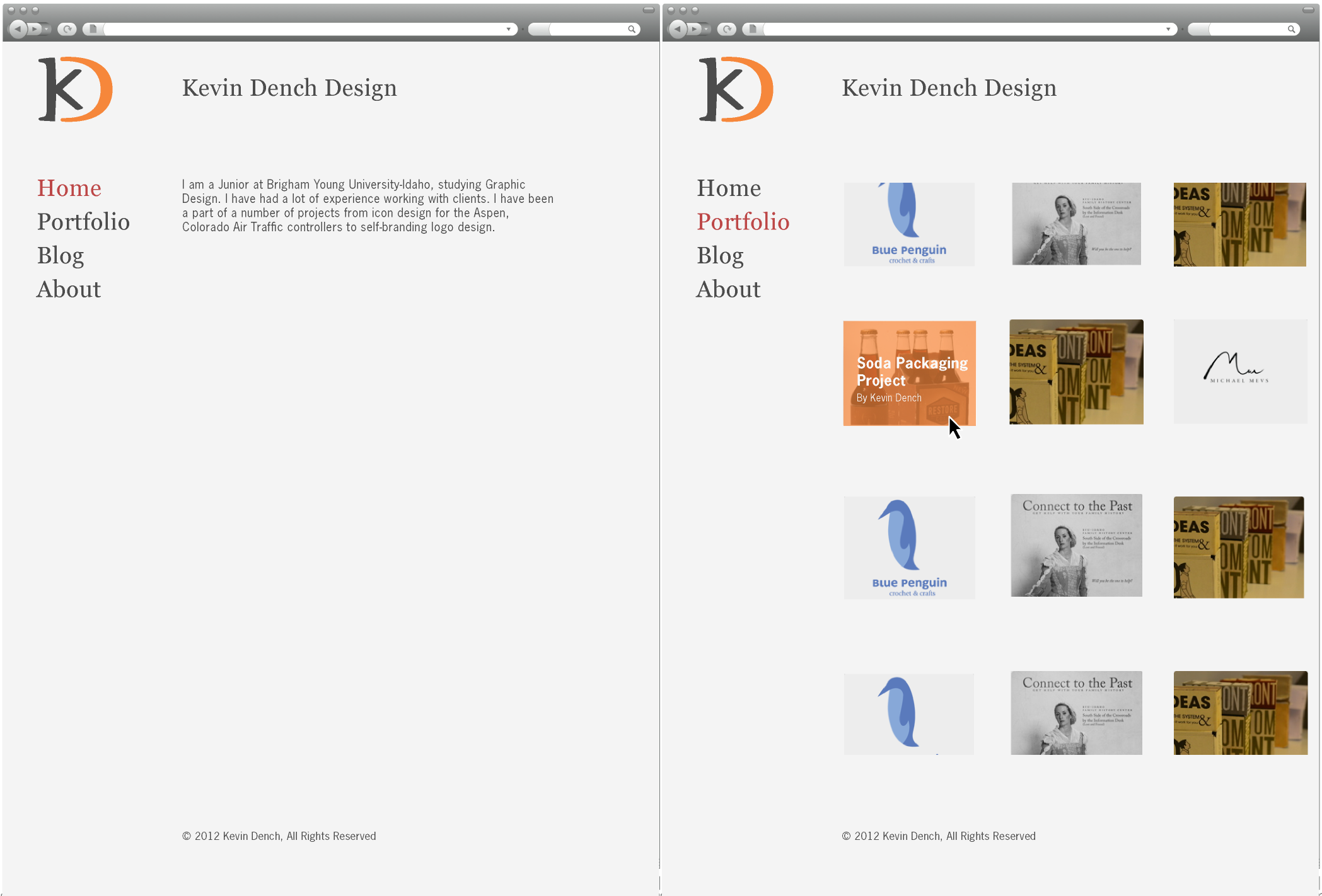
I will have rectangular thumbnails of my work. When the mouse rolls over the work, it will produce an Orange (#F6873B) color, with 70% opacity over the thumbnail. On top of the orange, an h4 heading label in News Gothic std, helvetica or Sans Serif. It will be in 15px Bold and #F9F9FA. This will be the name of the project. My name will be directly below that title in a h5 heading label, in News Gothic, Helvetica, or Sans Serif at 10px regular and #F9F9FA. Once a thumbnail is clicked on it will take the visitor to the piece. I have 11 pieces that I would like to put up on my website. The number will get larger as my school career progresses. The names of the pieces (and other main pages) are:
Main Pages
- Home Page
- Portfolio
- Blog
- About
Portfolio Pages
- Work for clients: Epileptic Ninja
- Work for Clients: Monograms
- Work for Clients: Blue Penguin
- Work for Clients: Family History
- Book Cover
- Typography Experiments
- How to Make a Shirt Burrito
- Easter Egg Instructions
- Logo Project
- 50 Cards Project
- Soda Packaging Project
I will include content with each page: project descriptions, notes about the project, images of the project, video, or audio--whichever is appropriate.
Inside the Piece
Inside the piece they will find a description of the work they’re looking at, as well as additional pictures of it. The title and project name will be a h2 heading in Georgia, Bookman Old style or Serif at 19 px. in #4C4C4C. The pictures won’t be clickable, because I will make them small so the page loads quickly. Occasionally I will also embed documents from Issuu.com, which is a website where you can upload PDFs and turn them into "books" that can be embedded. I will use this for process work I have put together from different classes.
About
kevindenchdesign.com/about
Copy
There will be text indicating they found my “about” page, I hope to make it professional but lighthearted at the same time. Something to the effect of "Take some time to learn some things about me. If that prospect terrifies you, turn back now!" I will have a brief history of my experience with design. This will include my school and that I am pursuing my Bachelor’s in Graphic Design. I will have links in the form of icons at the bottom to my Behance and Linkedin profiles.
Picture
I will have a single, solitary image in black and white of myself here to achieve a certain level of transparency, putting a face to the site.
Blog
kevindenchdesign.com/blog
Copy
On the blog page, there will be copy that indicates they are on the blog page. It will have a short description of the blog and then a link. I will also put a link to any other design blogs that I start here as well. No pictures, except for maybe some icons. No video or audio.
Contact
kevindenchdesign.com/contact
Copy
There will be text indicating they found my “contact” page. I will have a link on this page for them to email me for price inquiries. There will also be a "mailto" link within the body copy, so that they can email me if they would like to hire me as well. No pictures, except for maybe some icons. No video or audio.
Web Site Style Guide:kevindenchdesign.com
Color Scheme
-

Hex: #E7E7E7 Light colored, highlight for hex code.
RGB: (231, 231, 231) -

Hex: #4C4C4C
RGB: (76, 76, 77) -

Hex: #F6873B
RGB: (246, 135, 59) -

Hex: #BD4848
RGB: (189, 72, 72) -

Hex: #F9F9FA Light colored, highlight for hex code.
RGB: (249, 249, 250)
Examples of Color Scheme:
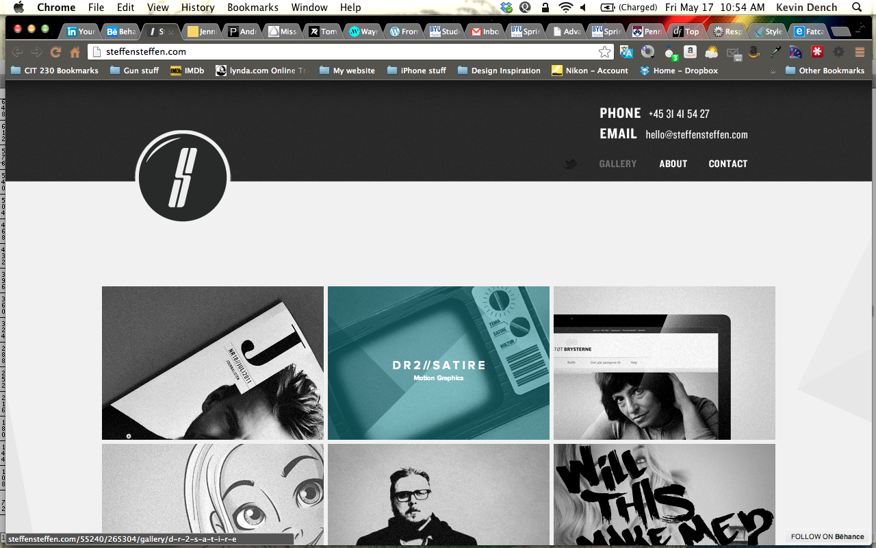
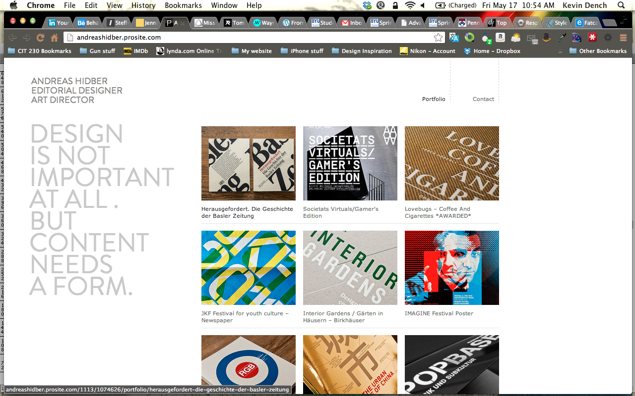
Typography
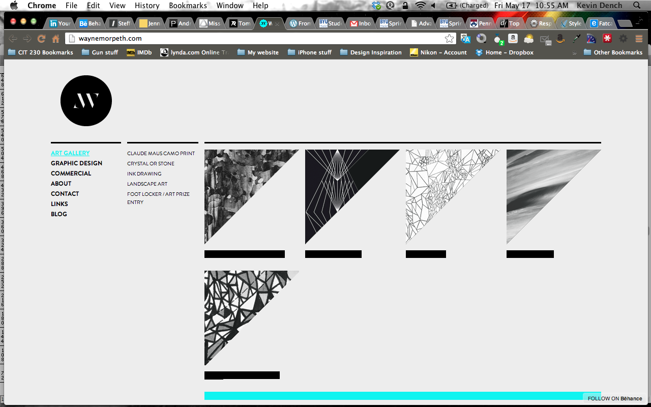
The typography for the website will be relatively basic. I would like to have as few typefaces as possible, and my own hand-picked secondary choices. I want the pages to load very quickly and I think this may contribute to speed. I also don't want my site to look like it has a whole lot going on. When the user comes to the site, I don't want them to feel lost right away. So I will take a minimalistic approach to the design. This is the best way to incorporate speed and design to my website.
Examples of Typography:
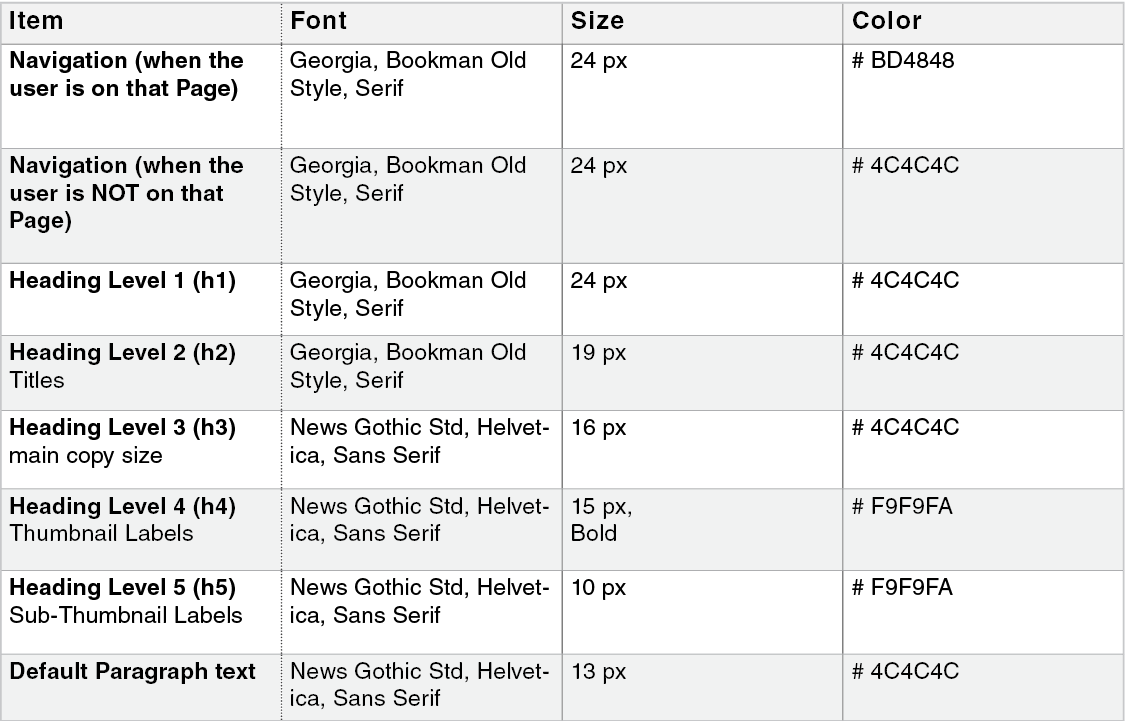
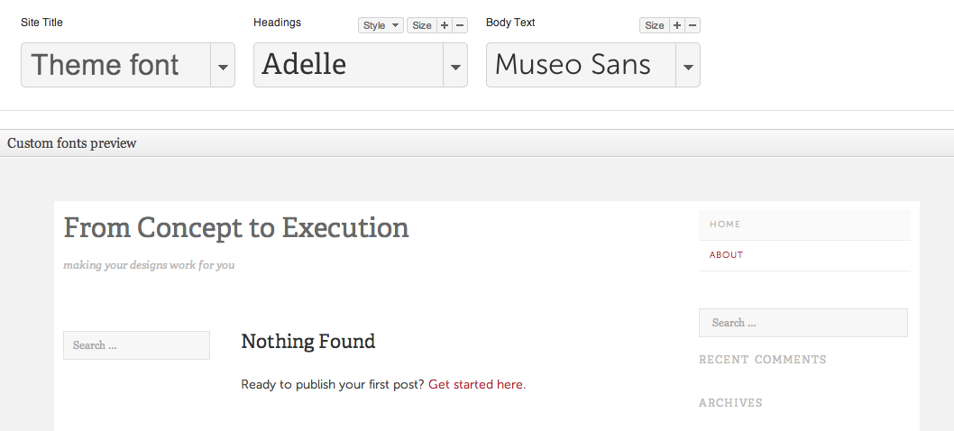
Navigation
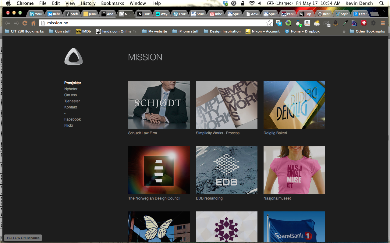
The navigation will be on the left side of the screen. As the user scrolls down the navigation will be static. Because of this, the user will be able to access the navigation at any point. I want my logo to be above the navigation, and to also be static, along with the heading that says, “Kevin Dench Design”, this will create a small window that the user can view things through. When the user clicks a link on the navigation, there will be an action upon the user hovering over the link. It will change color slightly. Then when they click on, say, “Portfolio” the link will change color to red, for as long as they’re accessing the “Portfolio” page. The same will go with the other pages. This will tell the user what page they are on if there doesn’t seem to be an indication, which I have planned so that there will always be an indication.
Examples of Navigation:
Responsiveness
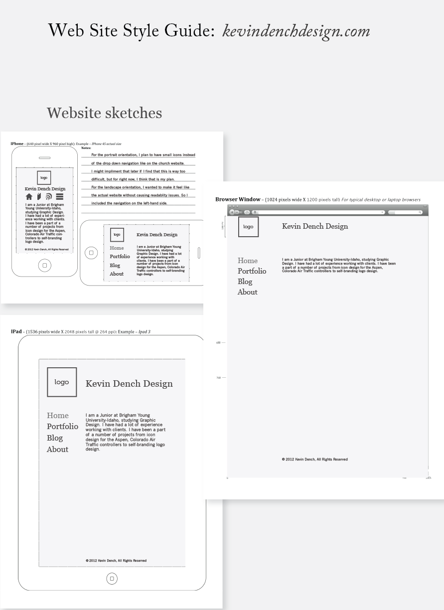
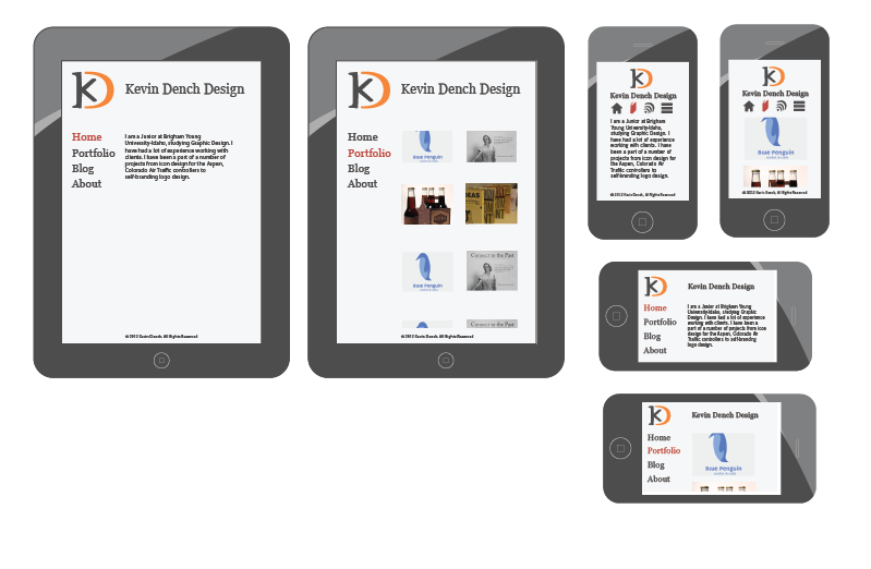
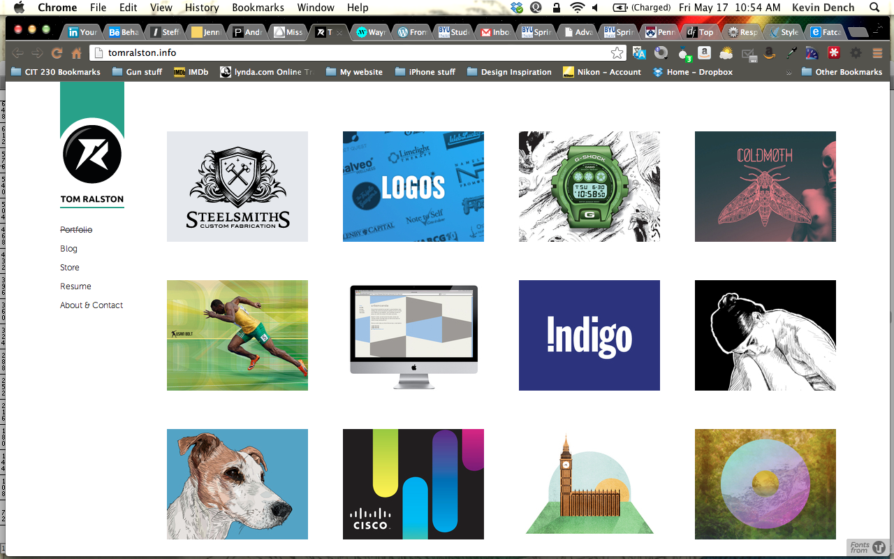
A lot of the people who will be accessing my site will likely be accessing it through a mobile device. This site will be mobile friendly. iPad: Upon going to the site there will be quite a bit visible, however, the logo and the site name will be the largest part on the page. The navigation will be the second largest entity of the page. When they go to a media page, like my portfolio, then they will see only two columns of thumbnails instead of the three that they would see on a browser. iPhone: When the iPhone is in portrait orientation, then there will be icons at the top of the page instead of navigation. The space is more of a premium and this is why I thought to use icons. Once in a landscape orientation the navigation will reappear, because they will have the room again. I hope to be able to accomplish this, because I think it would be a User Experience note that should not be overlooked. Browser: The website will appear as designed here. The media page will be static, and have a maximum of 4 columns of thumbnails. That way, there isn’t the uncertainty of what a user’s screen resolution is going to be.
Examples of Responsiveness: